Ensure your proposal considers the following:
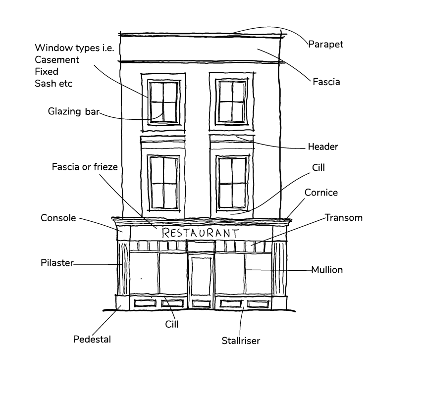
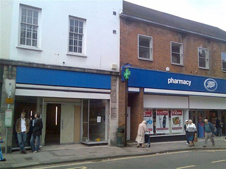
- The fascia, where the name of the establishment is displayed, should respect the proportions of the rest of the shopfront and the building in which it is set. It should not be too deep, wide or project forward from the face of the building, and should avoid illumination;
- Pilasters and consoles should be used to support the fascia. They are sometimes decorated and often form an important part of the overall shopfront design;
- Stallrisers provide a strong visual base to the shop window and can serve as additional security and protection;
- Shop windows should generally be subdivided to achieve well-proportioned frontages respecting the building's age and architectural style. In some cases, glazing bars help to create visual relief, rhythm and an attractive design;
- Doors are often recessed and have a solid lower panel which at least matches the height of the stallriser;
- Materials should be in keeping with the character and appearance of the building;
- Modern ‘Dutch’ blinds and canopies in plastic or similar materials which do not retract are often obtrusive to the appearance of the building and street scene and unlikely to be acceptable on listed buildings or in conservation areas;
- Projecting and hanging signs, if they are necessary, should be small and traditional in design. Hand-painted signs hung from wrought iron brackets should be carefully positioned so as not to obscure details of the shopfront or other parts of the building;
- When considering hanging signs over pavements, make sure they do not cause issues for people including with visual impairment;
- Illumination of fascias and hanging signs is not encouraged in historic town centres and mixed-use areas where street lighting and shop windows should provide adequate light. Where necessary for late opening premises, it should be low key and discreetly positioned;
- Alterations to historic shopfronts must balance the requirement to preserve historic character with the needs of adequate access;
- Shopfront security can be very damaging to the character of the building and street. Sympathetic solutions, such as toughened glass, better internal lighting, internal video cameras and alarm systems can often be just as effective without the deadening effect of shutters and grilles;
- Repair of traditional shopfronts should always be the first option, rather than their wholesale replacement;
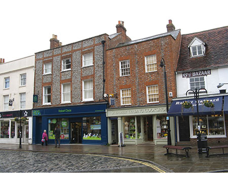
- The design of shopfronts in modern buildings, although allowing for innovation, should still reflect the basic principles of traditional shopfront design that have stood the test of time. New design should reflect both the character of the building and the street in which it is set;
- Advertisement colours and lettering should not be garish but should complement the architectural style of the shopfront, the building and the character of the area where it is located.


